Throughout this century, Formula 1 has showcased some stunning liveries, but not all have been well-received. Among the ugliest F1 liveries this century are designs that stood out for the wrong reasons, capturing fans’ attention with their bold—and sometimes baffling—choices.
From one-off race showcases to season-long experiments, these liveries have sparked debate and remain memorable for their lack of aesthetic appeal.
Notable examples of unappealing F1 liveries since 2000
In Formula 1, liveries serve as high-speed advertisements for teams and their sponsors, but some have missed the mark spectacularly. These eight liveries demonstrate design decisions that, while unforgettable, were not always popular with fans or pundits alike.
Red Bull’s Star Wars Tribute at Monaco (2005)
At the 2005 Monaco Grand Prix, Red Bull joined forces with Star Wars creator George Lucas to launch a themed design promoting Revenge of the Sith. The RB1 was adorned with Darth Vader imagery and fiery motifs, marking an unusual and highly distinctive look.
Although the livery was not considered visually appealing, it succeeded in remaining memorable, still discussed nearly twenty years later.
Jaguar’s Luxury Flop Featuring Real Diamonds (2004)
Jaguar attempted a lavish promotion for Ocean’s Twelve by embedding genuine $300,000 diamonds into the nosecones of their cars. This risky design broke the traditional advice of avoiding red and green combinations, and unfortunately, during a first-lap crash involving Christian Klien, one diamond was lost on the track and never recovered.

The combination of impracticality and aesthetics made this a rare misstep for Jaguar’s branding.
Honda’s Environmental Message with the 2007 Planet Earth Livery
Honda’s 2007 design aimed to highlight global warming awareness and their green initiatives. This “Planet Earth” livery sought to connect with environmental themes, but even with its noble intent, it was divisive among fans and critics.
Its inclusion in this list reflects the livery’s failure to impress visually, despite its commendable purpose.
Red Bull’s Glittery Las Vegas Scheme (2024)
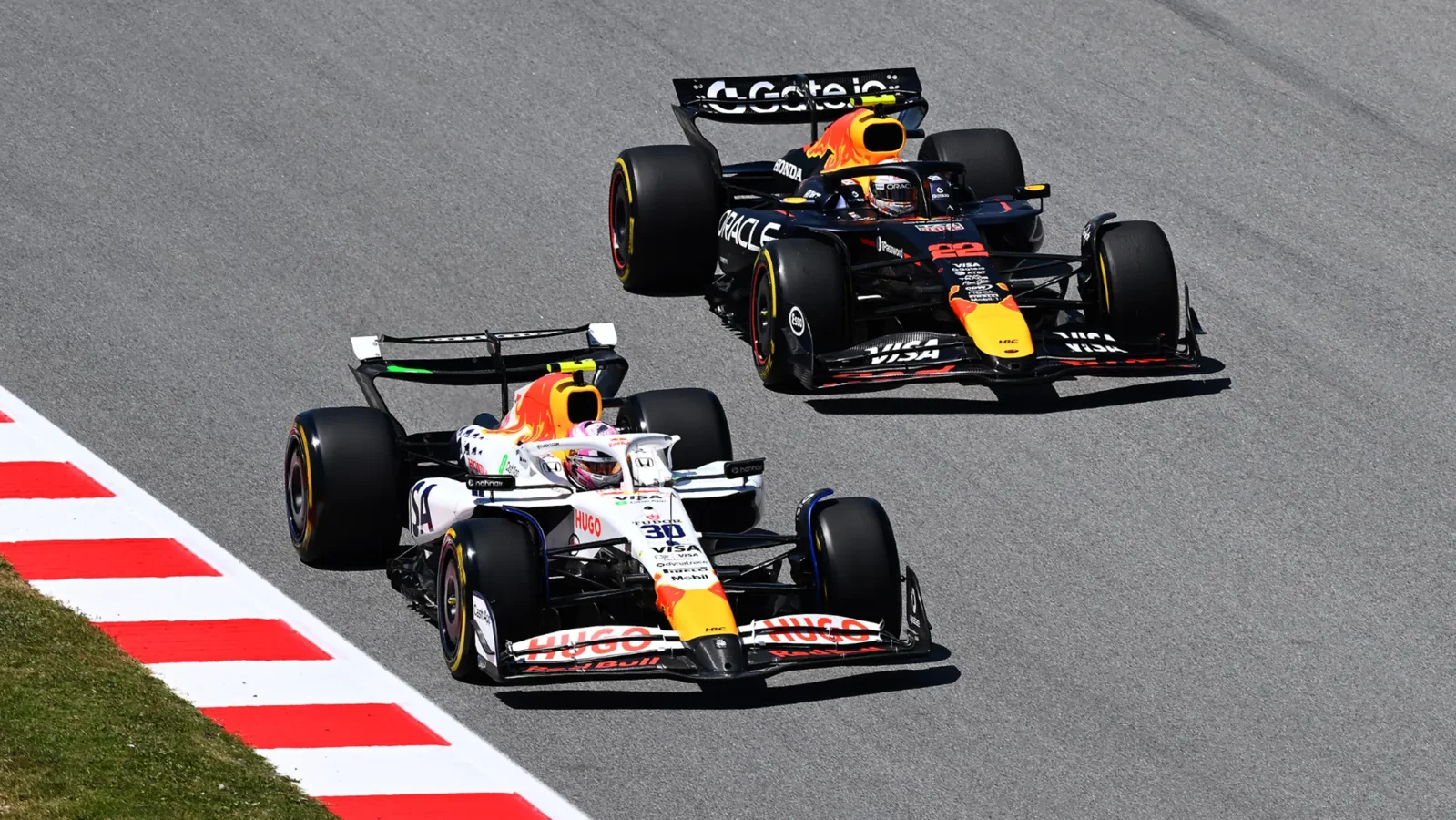
In 2024, Red Bull’s sister team VCARB showcased a new livery at the Las Vegas Grand Prix, inspired by early 2000s Sauber designs. The sparkling color blend mostly worked, but a large red patch on the Halo disrupted the overall balance, resulting in a look that felt uneven.
The concept was creative but the execution left some fans wanting more cohesion.
McLaren’s Nearly Chrome “Throwback” (2023)
At the 2023 British Grand Prix, McLaren revived a near-chrome livery reminiscent of their early-2000s style. However, the mixture of chrome and papaya orange tones did not quite blend, creating a clash rather than a harmonious throwback.
The team later increased the chrome ratio in 2025, though some fans hope for a full chrome return in future seasons as a true tribute.
Ferrari’s Blue Accents Spark Debate (Miami 2025)
Ferrari debuted a new color scheme for the Miami Grand Prix, shifting to blue and white race suits for drivers Charles Leclerc and Lewis Hamilton in homage to the North American Racing Team era. Fans wondered if the entire car would embrace the blue-and-white look.
The actual design combined traditional Ferrari colors with the blue accents, resulting in a livery many viewed as a “missed opportunity” to make a bold statement this season.
Renault’s Clashing Palette Switch (2007)
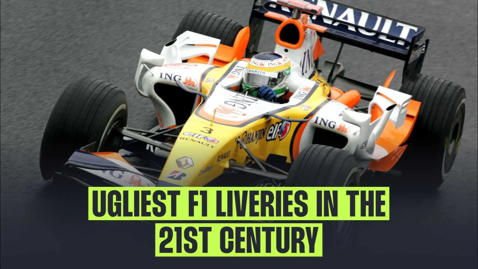
Following Fernando Alonso’s back-to-back championships, Renault altered its iconic blue and yellow colors in 2007 due to a new title sponsor. This change introduced a mix of white, yellow, orange, and blue that many considered a confusing combination unlikely to please the eye.
The attempt to refresh the livery ended up alienating fans who had grown attached to the previous clean design.
Caterham’s Attempt to Conceal the Front Wing (2014)
The 2014 season was notable for F1 teams experimenting heavily with car design during the turbo hybrid transition. Caterham‘s CT05 featured a two-tone livery that shifted from green to black along the nose, seemingly trying to “hide” its unusually long front wing.
This design choice stood out, but not necessarily in a positive way, contributing to a less than attractive overall appearance during a year already criticized for unappealing cars.
BAR’s Split Livery with a “Zip” (1999, Honorable Mention)
Although just outside this century, BAR’s design is worth mentioning due to its unusual “two liveries in one” concept. Divided by a central “zip,” one side of the car was navy blue, and the other displayed the team’s familiar white and red colors, creating a dramatically different look depending on which direction the car turned.
Frequently listed among the ugliest F1 liveries in history, this design’s boldness earns it a place in discussions about unpopular car aesthetics.
The Lasting Impact of Unpopular F1 Liveries
These liveries demonstrate that even in an elite motorsport like Formula 1, not every aesthetic choice resonates with fans. While some designs remain notorious and often criticized, they also underscore the challenge teams face balancing sponsor visibility, marketing creativity, and visual appeal.
Looking ahead, teams will continue pushing design boundaries, and while some will succeed in captivating viewers, others may find themselves remembered for all the wrong reasons as part of the ugliest F1 liveries this century.

